Key Takeaways
- Embracing minimalist layouts enhances focus on imagery.
- Implementing dark mode and high-contrast aesthetics can make photos stand out.
- Incorporating interactive elements, such as parallax scrolling, adds depth to the user experience.
- Utilizing AI-driven tools can streamline gallery creation and client management.
Table of Contents
- Minimalist Layouts
- Dark Mode and High-Contrast Aesthetics
- Interactive Elements
- AI-Driven Tools
- Mobile-First Design
- Conclusion
In the ever-evolving digital landscape, photography websites must stay ahead of design trends to captivate audiences and showcase portfolios effectively. Photographers and visual artists are increasingly seeking modern solutions to display their work, improve engagement, and establish a powerful online presence. For inspiration, exploring photography website examples can help spark creativity and reveal the range of possibilities in visual storytelling. The ongoing advancement of technology and shifting audience preferences are continuously reshaping what it means to have a standout photography website.
Understanding these trends will not only elevate a site’s visual appeal but also enhance user engagement and accessibility. From layout design to integration of advanced tools, every element matters when presenting a polished portfolio. Keeping up to date ensures photographers are equipped to display their work in the best possible light and remain competitive in a saturated digital space.
Minimalist Layouts
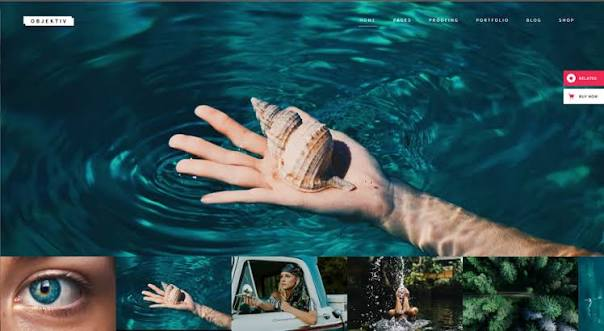
Minimalism has taken center stage in photography and web design for its ability to showcase images without distractions, through spacious layouts, limited color palettes, and understated typography. Minimalist designs direct visitors’ full attention to the photographer’s portfolio. Elements like generous white space give each photograph room to breathe, allowing viewers to focus on the artistry behind each image. Clean grids, simple navigation bars, and subtle hover effects contribute to a frictionless experience that highlights the work rather than the website’s framework.
As photographers adopt a less-is-more philosophy, they also explore new ways to incorporate their branding into the minimalist context subtly. For example, using signature color accents or unique logo placement can help artists express their individuality while maintaining a clean overall look. Minimalist layout strategies are especially beneficial for those who wish to emphasize visual storytelling without overwhelming viewers with busy backgrounds or an abundance of text. The result is an online portfolio that not only draws attention to each shot but also extends a professional, sophisticated ambiance.
Dark Mode and High-Contrast Aesthetics
Dark mode has rapidly grown in popularity on photography websites, not only for its contemporary look but also for how it brings out the vibrancy and tonal range of photos. Bold backgrounds with light or vivid accent colors increase the contrast, making images visibly pop and leaving a lasting visual impression. High-contrast aesthetics also improve text readability, especially when captions or photographer bios are displayed alongside the portfolio. Furthermore, dark mode reduces eye fatigue during prolonged viewing in low-light environments, thereby enhancing overall user comfort and engagement.
Emphasizing a balance between light and dark presentation, many websites now offer a toggle option that lets users switch between modes. This adaptability allows visitors to select viewing preferences, catering to accessibility and comfort. It’s a trend that aligns closely with the broader shift toward digital inclusivity, giving every potential client or fan the ability to appreciate images in a way that best suits their needs. Additionally, dark, high-contrast themes can convey a sense of sophistication and modernity that aligns well with the visual arts community.
Interactive Elements
Modern users seek more than passive viewing; they look for engagement. Photography websites are now incorporating interactive features to create deeper, more memorable experiences. Elements such as parallax scrolling, where backgrounds move at a different speed than foreground content, and smooth on-scroll animations help add dimension and visual intrigue. Image sliders, hover-to-reveal captions, and clickable portfolios encourage visitors to explore more of the content. The key is to balance these interactive touches with overall usability, ensuring the site remains easy and intuitive to navigate. Overloading a site with animations can detract from the primary goal: displaying high-quality photography.
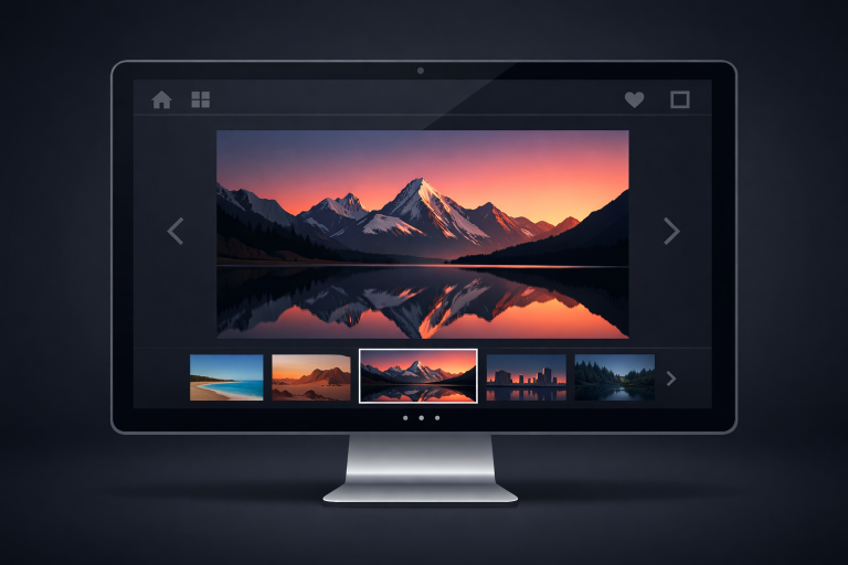
A trend gaining traction is the integration of subtle microinteractions, small animations, or responses triggered by user gestures like clicking, tapping, or hovering. These provide immediate feedback and reinforce a sense of control, adding another layer of polish to the browsing experience. Other popular features include infinite scrolling for gallery pages, interactive maps for location-based projects, and real-time commenting for audience engagement. When thoughtfully implemented, these elements not only keep visitors on site longer but also foster a deeper sense of community and brand affinity.
AI-Driven Tools
The integration of artificial intelligence tools is transforming website management for photographers. AI-driven platforms now automate routine tasks such as gallery creation, tagging, and content organization. For instance, tools that scan uploaded images and automatically apply context-aware keywords expedite portfolio construction and search optimization. AI-driven client management solutions help photographers keep track of appointments, inquiries, and contracts, streamlining the business side of creative work. As noted by major industry publications like TechRadar, AI not only increases productivity but also enables creatives to focus their energy on artistic growth.
Looking forward, advancements in AI may lead to even more innovative uses, such as automatically generating personalized galleries for visitors based on their browsing patterns or integrating smart chatbots that handle inquiries and bookings seamlessly. The potential efficiencies created by these innovations empower photographers to offer a more tailored, responsive experience while freeing up more time for actual creative work. In an era of rapidly evolving technology, staying current with AI developments can be a crucial differentiator for photography professionals seeking a competitive edge online.
Mobile-First Design
With mobile devices accounting for a significant share of web traffic, adopting a mobile-first approach is non-negotiable. This design philosophy prioritizes the mobile browsing experience and scales up to tablets and desktops. Essential elements for mobile-first design include concise menus, large tap targets, fast-loading high-resolution images, and easily accessible contact options. By ensuring that portfolios display flawlessly on smartphones, photographers can reach audiences wherever they are and maximize opportunities for direct engagement. Recent studies, such as those covered on Statista, highlight the surge in mobile internet use, underscoring the need for responsive design on photography sites.
Besides ensuring basic navigation and display issues are resolved on smaller screens, a mobile-first strategy enables creative mobile features such as vertical galleries, thumb-friendly navigation, and mobile-optimized lightboxes or slideshows. Simple performance enhancements, such as lazy-loading images and compressing files, can lead to faster page loads, which are essential for keeping users interested. Exploring push notifications and mobile-integrated contact forms can further drive conversions and user engagement on the go.
Conclusion
Keeping up with the latest design trends is truly essential for photographers who want their websites to stand out in a crowded market. Minimalist layouts, dark mode, interactive elements, AI-powered tools, and mobile-first strategies are not just fads; they represent the next evolution in online portfolio design. By thoughtfully implementing these approaches, photographers position themselves to offer accessible, visually stunning, and engaging showcases of their work, ultimately connecting more meaningfully with potential clients and admirers.
As we look ahead, it’s clear that photography websites will continue to evolve alongside broader shifts in technology and digital tastes. Prioritizing both aesthetic appeal and functional innovation is the key to future-proofing an online presence. Photographers should continually re-evaluate their design choices and leverage new platforms and integrations to stay relevant. Endowing sites with personality, adaptability, and ease of use will ensure lasting impact, allowing artists to focus on creativity while making a strong digital impression in an increasingly visual world.